The Problem The Solution The Impact
All Case Studies
Interaction Design Color Systems Prototyping Safety-Critical UX

Drawing users' attention to the right place at the right time.

Designing an intuitive color status system to bridge the gap between a physical scanner instrument and its software — reducing confusion, improving workflow clarity, and protecting patient safety.

Role Full Stack UX Designer
Timeline 2024
Platform Scan Application + Instrument UI
Deliverables Color System, Prototype, Dev Specs

The VENTANA DP 200 — the physical scanner whose LED status system the color design had to align with.

Overview

Where physical hardware meets digital interface

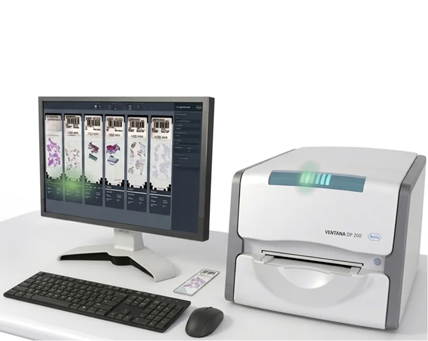
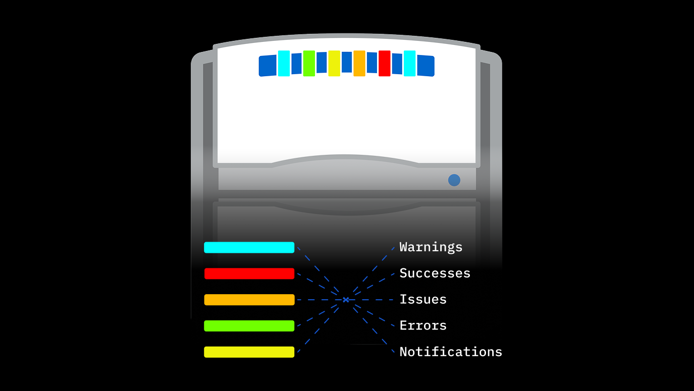
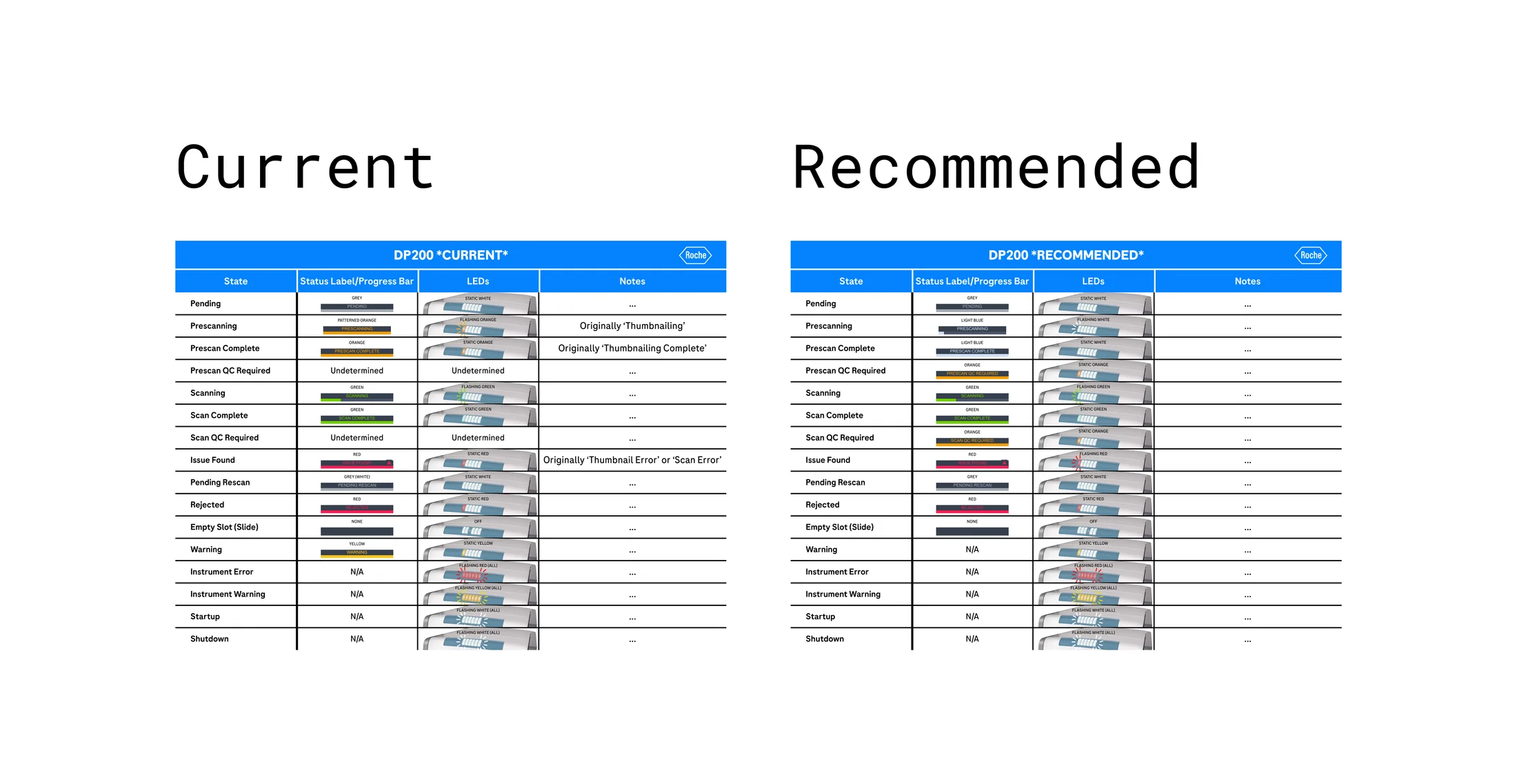
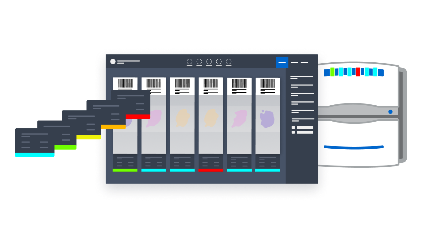
Roche's scan application software interfaces with their flagship scanners to facilitate high-definition imaging and digitisation of pathology slides — enabling remote scoring from anywhere in the world. The system uses colored lights both in the UI and on the physical scanner instrument to communicate complex workflow and error statuses to lab operators.

The challenge: those two systems — the instrument lights and the software status indicators — were not speaking the same language. The disconnect was creating confusion in the lab, slowing down operators, and introducing a risk to patient safety through potential delays in care.

The problem Misaligned color indicators between a physical scanner and its software UI were creating confusion and patient safety risks in clinical labs.
The solution Designed a unified color system and built a novel Figma prototype that simulated the physical instrument digitally — no hardware access required.
The impact Delivered on time and within scope, keeping design out of the critical path and eliminating the hardware/software disconnect.
The VENTANA DP 200 scanner alongside a monitor displaying the scan application software — the two surfaces whose status indicators needed to be unified

The Problem

A disconnect that put patient safety at risk

The status indicator lights on the physical scanner instrument and those displayed in the software UI were misaligned — both in color meaning and in the states they communicated. For lab operators managing high-pressure workflows, this created a real cognitive burden: which light do I trust? What does this color actually mean right now?

This wasn't just a usability problem. In a clinical pathology environment, confusion around instrument status can directly delay diagnosis. A slide mishandled at the wrong moment, a workflow stalled while an operator deciphers conflicting signals — these have downstream consequences for patients. The design needed to eliminate that ambiguity entirely.

Key constraint

The scanner's LED palette was fixed at five colors — white, yellow, orange, red, and green. The hardware couldn't be changed. Any solution had to work within what the instrument could physically produce.

Unintuitive status indicators
Instrument vs. UI color mismatch
Risk to patient safety
Inconsistency across products
The physical scanner instrument showing its LED color palette with color swatches below mapped to semantic states: Warnings, Successes, Issues, Errors, and Notifications

The solution

Creating clarity between instrument and software.

The goal was to strategically create an intuitive, unified connection between the scanner instrument and the user interface by addressing two things simultaneously:

01 Design a color system

A system for status indicators that helps users intuitively navigate and understand workflow and error states — warnings, successes, issues, errors, and notifications — without needing to memorise meanings.

02 Align with Roche scan app software

Create a learnable, consistent experience across the product family — so that operators moving between products carry their mental model with them.

03 Test with users

Validate the color system with users without access to implemented software or hardware — to understand its efficacy and drive development decisions.

Key decision

Rather than designing freely and retrofitting to hardware limits later, I reversed the process — auditing every instrument state first, mapping semantic meaning onto the colors that already existed, and building the system outward from the constraint.

Workshopped color system with stakeholders
Created high-fidelity prototype
Tested new color system with users
Handed off to development
Color state mapping — current vs recommended across all DP200 scanner states

How do you prototype the interaction between a physical device and its software without access to either?

The central design challenge was unique: I needed to visually communicate and discuss design decisions involving a physical instrument — without access to that instrument, and without the ability to modify production code to test color combinations live.

The solution was to treat the prototype itself as a communication tool. By embedding a faithful digital replica of the scanner inside the Figma prototype, I created a shared reference point that made design decisions legible to developers, stakeholders, and product owners alike — eliminating ambiguity and compressing the feedback loop significantly.

A second constraint was the hardware itself: the scanner's LED system had a fixed palette of available colors. The design system had to work within those hardware limits, mapping the right semantic meaning to each available light color rather than designing freely and discovering limitations late.

The impact

Designing within constraints to deliver faster.

The most significant outcome wasn't just delivery — it was the method. By building a faithful digital replica of the physical scanner inside Figma, I created a way to prototype hardware-software interactions without access to either. That approach compressed the feedback loop between design and engineering significantly, freeing both teams from the back-and-forth that would otherwise have consumed the timeline or resulted in a worse experience for users.

The color status feature update shipped on time and within scope, complete with detailed implementation documentation. Design stayed out of the critical path — downstream activities were unblocked, and the product team maintained their development timeline without compromise.

Delivered on time & within scope
Novel physical-digital prototype method
Unified color system across products
Design kept out of critical path
Three-part composition showing a fanned stack of UI screen iterations, the scan application interface with color-coded slide statuses, and the physical scanner with matching LED indicators
Next Case Study Supercharging iteration through modularized Figma components.

Get in touch

Interested in connecting?

I'm always open to discussing new opportunities, collaborations, or just a good design conversation.