Case Studies

Password required

Incorrect password. Try again.

The Problem The Solution The Impact
All Case Studies
Design Systems Figma 2024 Roche

Supercharging iteration through modularized Figma components.

Built a modular, scalable Figma frame system for the navify Digital Pathology (nDP) product — enabling agile, high-fidelity mockups for a fast-paced design team working with detail-oriented pathologist users.

Role UX/UI Designer
Client Roche
Timeline 2024
Tool Figma
The problem
What I did
The outcome
navify Digital Pathology component overview

Overview

One design language across a fragmented product suite

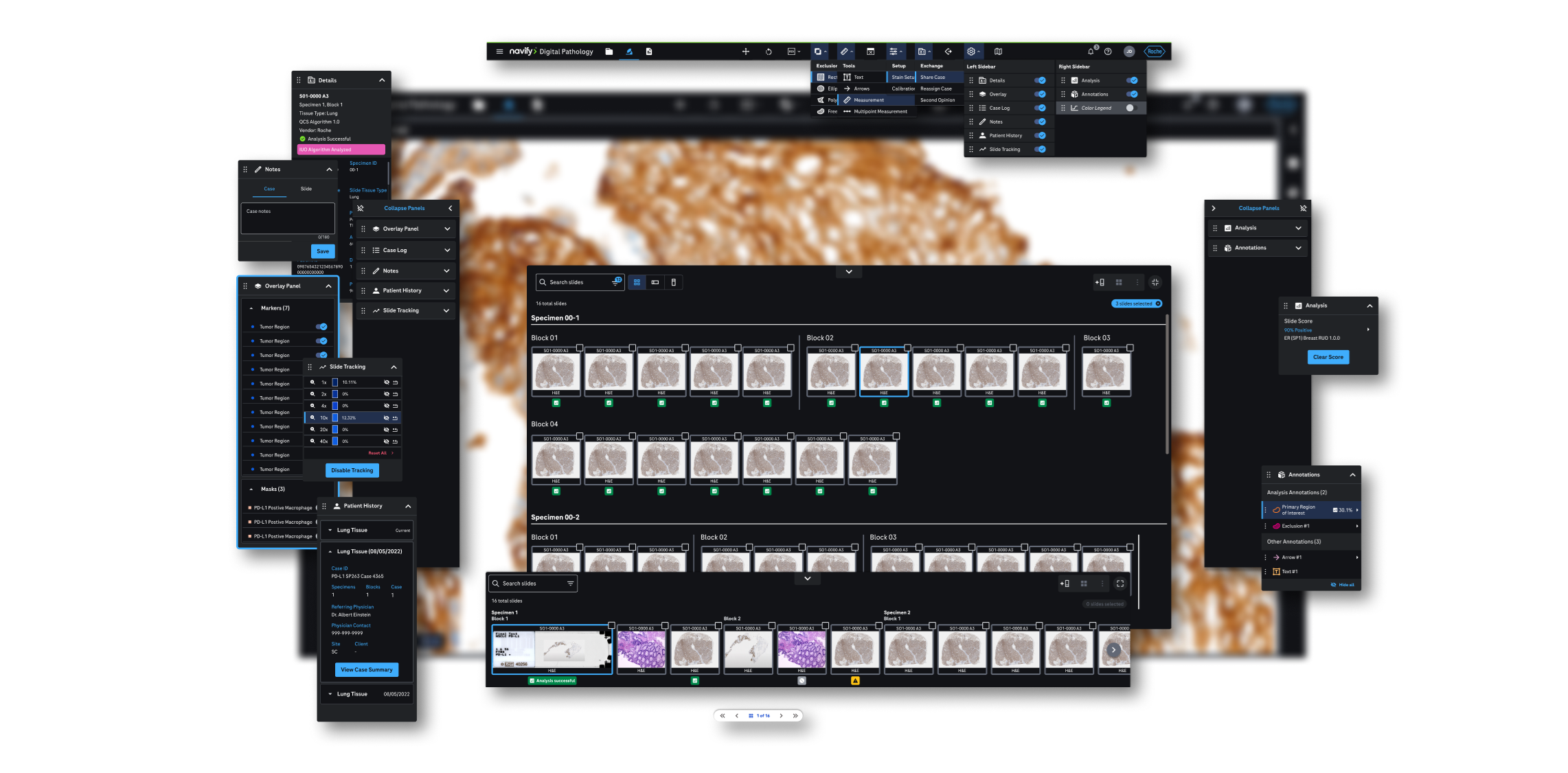
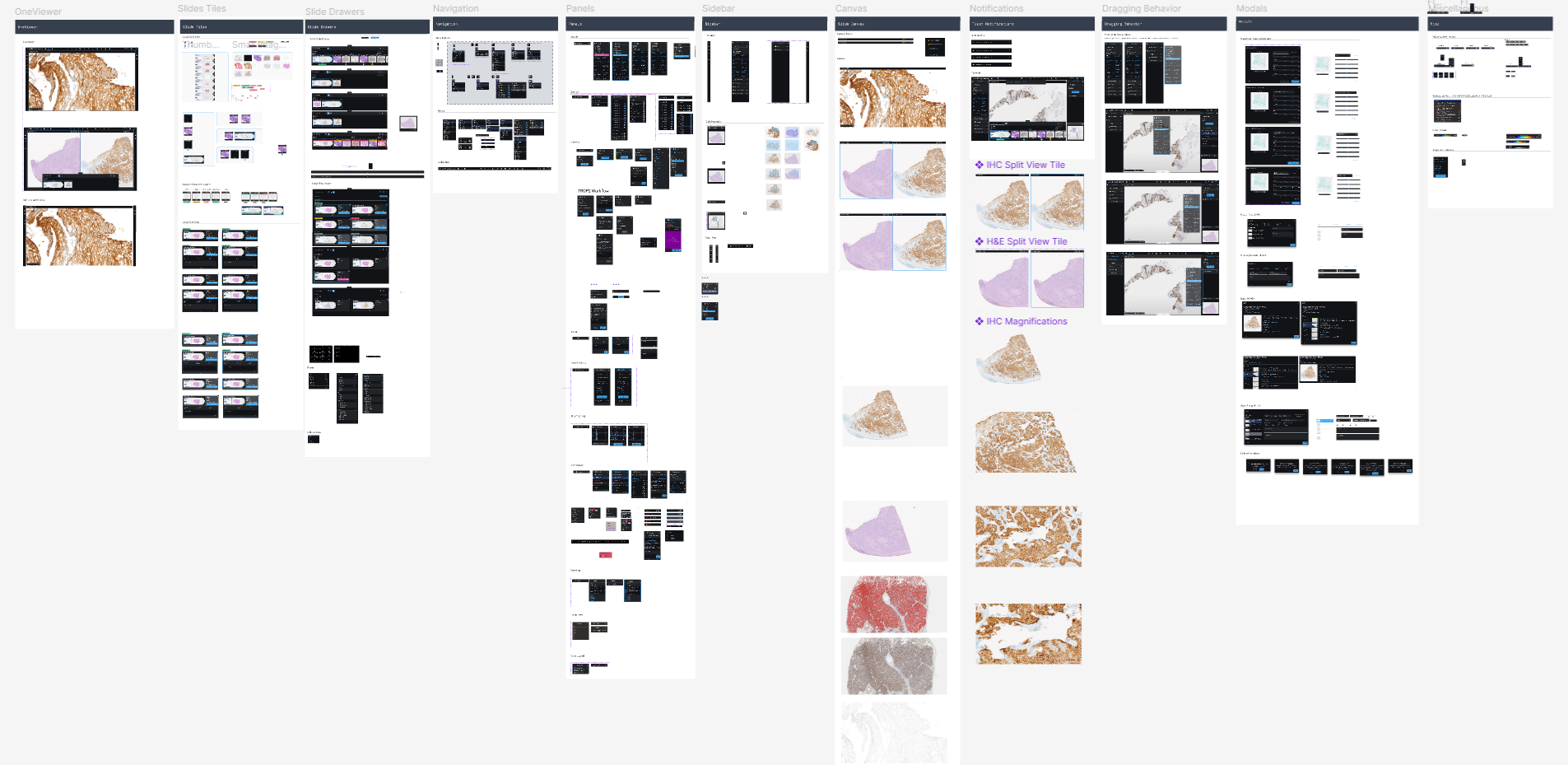
Roche's digital pathology suite spans multiple interconnected products — each with its own design team, working in parallel across different geographic locations. Over time, this had produced a sprawling Figma environment where components were duplicated, naming conventions differed between files, and updating a shared element meant tracking down every instance across multiple libraries manually.

The goal of this project was to create a single, modular component system that all product designers could adopt without disrupting their existing workflows — a shared source of truth that would keep the product suite visually and functionally consistent as it scaled.

The Problem

High-fidelity mockups take too much time and attention to detail.

Without a unified component library, designers across the product were effectively rebuilding from scratch for every iteration. Complex product configurations, diverse workflows, and a highly technical user base of pathologists demanded frequent, high-fidelity mockups — but the tooling to produce them quickly didn't exist.

  • Complex product configurations, workflows, and functionalities
  • Need for quick iteration and new high-fidelity mockups
  • Regular feedback sessions with detail-oriented pathologist users
  • Fast-paced project timelines for design deliverables
Demonstrating the pain of building high-fidelity mockups without a modular system

The Solution

Create a modular Figma frame to enable agile, high-fidelity mockups.

The answer was a single master frame — a "one frame to rule them all" system that would let designers copy, paste, and toggle to produce any UI configuration in minutes rather than hours.

  • "One frame to rule them all" mockup of the full product UI
  • Modular, scalable components that update automatically with the component library
  • Togglable variants and properties for customized screens
  • Pre-defined auto layout values for consistency across all configurations
Modular Figma frame in action — toggling variants to produce new screen configurations

The Process

Audit, architect, build, adopt

The system was built in four deliberate phases — each creating the foundation for the next.

Component Library

The nDP component library was built on top of Roche's OneDesign system, with custom components constructed using the OneDesign builder for product-specific use cases. Every interface element was built to high fidelity, then organized and labeled for future expansion.

nDP component library structure

Properties

Variants and properties were created for each component, logically mapped and configured so designers could toggle any state from the top level. The entire system was built with scalability and future library management in mind.

Component properties and variant structure

Master Frame

Component instances were arranged into a master frame that recreated the full nDP viewer UI. Careful layering allowed designers to toggle any variant from the master frame level, while refined spacing and padding conventions kept every configuration consistent.

Master frame structure showing layered component instances

Auto Layout Engineering

Panels expand and contract from the left, right, and bottom of the frame. Complex auto layout values were engineered to replicate the canvas-flexing behavior of the live product — meaning the design supports nearly any possible UI configuration without breaking.

Auto layout engineering — panels expanding and contracting across configurations

The Impact

Fast, effortless mockups for the UX design team.

Following rollout, creating a new high-fidelity mockup became "copy, paste, and toggle." The system eliminated rebuilding time and let designers focus entirely on solving interaction problems — not assembling screens. High-fidelity designs could now be edited on-the-fly during live user feedback sessions with pathologists, and all mockups stayed synchronized with the component library automatically.

What this project achieved:

Copy, paste & toggle — new screens in minutes
Real-time edits during live user feedback sessions
All mockups auto-synced with component library
Next Case Study Drawing users' attention to the right place at the right time.

Get in touch

Interested in connecting?

I'm always open to discussing new opportunities, collaborations, or just a good design conversation.